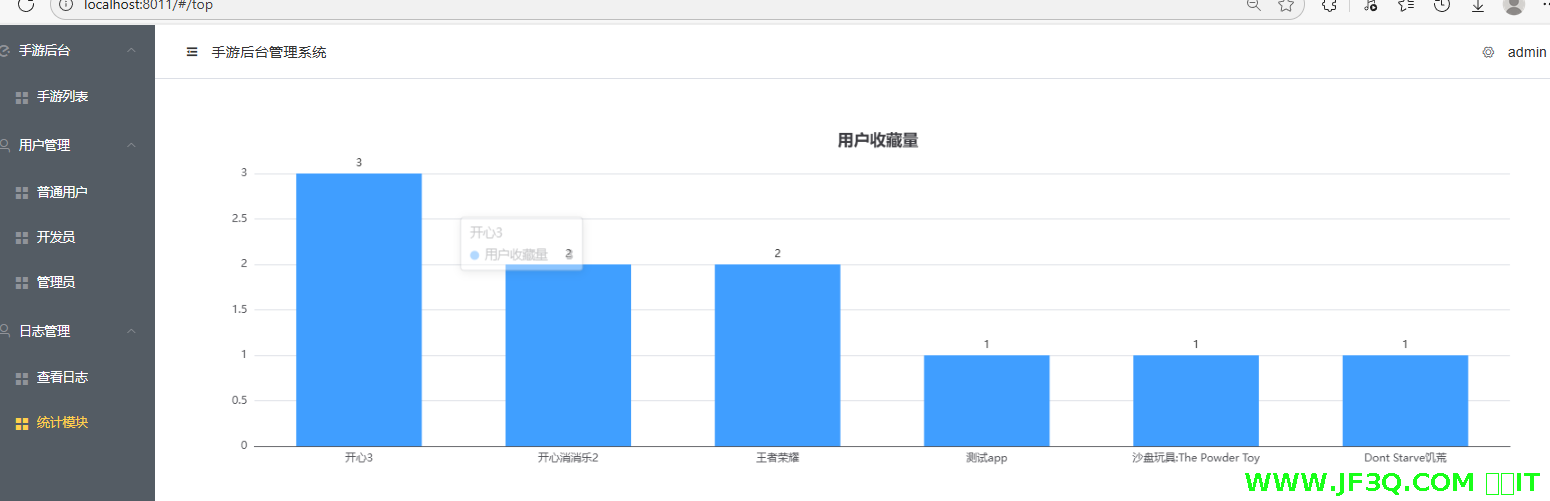
33.可视化统计功能-柱状图为例

分类: springboot vue 专栏: 【带小白做项目】SpringBoot+Vue后台管理系统 标签: 可视化 柱状图
2025-09-16 21:43:34 349浏览
可视化统计功能-柱状图为例,用的echarts实现的。后端需要用到分组查询-group by
统计哪些 app 收藏量比较高
搞一个柱状图吧,只展示前十名
前端用 echarts
效果图
最终的效果:
先说后端
效果如下
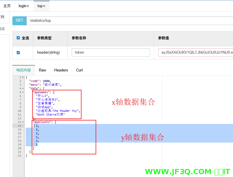
统计 control 层
  @Autowired
    UserinfoCollectService service;

    //统计哪些 app 收藏量比较高 搞一个柱状图吧,只展示前十名

    @GetMapping("/top")
    public ResultVo top(){

        List<TopVo> list = service.top();

        //还得继续封装StatisticsVo
        StatisticsVo statisticsVo = new StatisticsVo();
        statisticsVo.setAppCounts(new ArrayList<>());
        statisticsVo.setAppNames(new ArrayList<>());

        for (TopVo topVo : list) {
            statisticsVo.getAppNames().add(topVo.getAppName());
            statisticsVo.getAppCounts().add(topVo.getAppCount());
        }

        return ResultVo.success("统计结束",statisticsVo);
    }
封装了两个 vo
@Data

public class TopVo {
    String appName;
    Integer appCount;
}
@Data
public class StatisticsVo {
    List<String> appNames;//x轴
    List<Integer> appCounts;//y轴

}
sql 映射文件
   <select id="top" resultType="com.jf3q.app_back.vo.TopVo">
        SELECT
            a.softwareName as appName,
            COUNT(*) AS appCount
        FROM
            user_collect uc
                LEFT JOIN app_info a on uc.appid = a.id
        GROUP BY
            uc.appid
        ORDER BY
            appCount DESC
            LIMIT 0,10
    </select>
补充下下拉调皮的问题
不要用鼠标点,直接光标移动上去就行,耐心一点即可
前端 echarts 代码部分
注意的点
要安装echarts
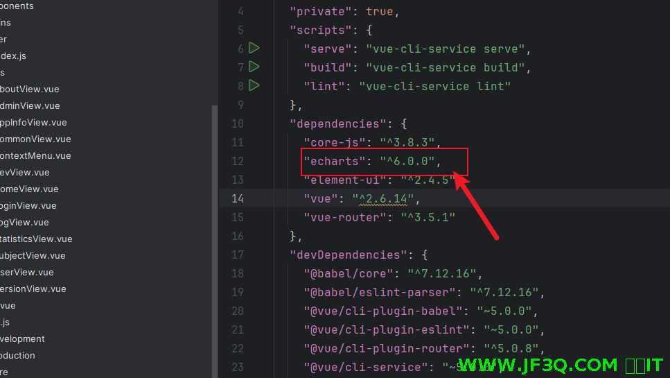
如果没装的话,可以直接用命令 npm install echarts
如果是指定版本安装的话,命令变成:npm install echarts@6.0.0
导入 echarts
import * as echarts from 'echarts'柱状图的话要调用接口获取 x 轴和 y 轴的数据
x 轴和 y 轴的数据一定要跟你的实际接口匹配
完整参考代码
<template>
<div class="chart-container">
<div ref="chartDom" style="width: 100%; height: 400px;"></div>
<!-- 加载状态 -->
<div v-if="loading" class="loading-overlay">
<el-loading></el-loading>
</div>
</div>
</template>
<script>
import * as echarts from 'echarts'
import { getXY } from '@/api/app'
export default {
name: 'BarChart',
props: {
// 图表标题
title: {
type: String,
default:'用户收藏量'
},
// 图表颜色
color: {
type: String,
default: '#409EFF'
},
// API请求参数
params: {
type: Object,
default: () => ({})
}
},
data() {
return {
chart: null,
loading: false,
xAxisData: [],
yAxisData: []
}
},
mounted() {
this.fetchData()
// 监听窗口大小变化
window.addEventListener('resize', this.resizeChart)
},
beforeDestroy() {
// 组件销毁时,移除事件监听
window.removeEventListener('resize', this.resizeChart)
// 销毁图表实例
if (this.chart) {
this.chart.dispose()
this.chart = null
}
},
methods: {
// 获取数据
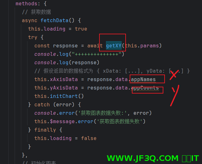
async fetchData() {
this.loading = true
try {
const response = await getXY(this.params)
console.log("++++++++++++++")
console.log(response)
// 假设返回的数据格式为 { xData: [...], yData: [...] }
this.xAxisData = response.data.appNames
this.yAxisData = response.data.appCounts
this.initChart()
} catch (error) {
console.error('获取图表数据失败:', error)
this.$message.error('获取图表数据失败')
} finally {
this.loading = false
}
},
// 初始化图表
initChart() {
this.chart = echarts.init(this.$refs.chartDom)
this.updateChart()
},
// 更新图表数据
updateChart() {
const option = {
title: {
text: this.title,
left: 'center'
},
tooltip: {
trigger: 'axis',
axisPointer: {
type: 'shadow'
}
},
grid: {
left: '3%',
right: '4%',
bottom: '3%',
containLabel: true
},
xAxis: {
type: 'category',
data: this.xAxisData,
axisTick: {
alignWithLabel: true
}
},
yAxis: {
type: 'value'
},
series: [{
name: this.title,
type: 'bar',
barWidth: '60%',
data: this.yAxisData,
itemStyle: {
color: this.color
},
label: {
show: true,
position: 'top'
}
}]
}
this.chart.setOption(option)
},
// 调整图表大小
resizeChart() {
this.chart && this.chart.resize()
}
}
}
</script>
<style scoped>
.chart-container {
width: 100%;
padding: 20px;
position: relative;
}
.loading-overlay {
position: absolute;
top: 0;
left: 0;
right: 0;
bottom: 0;
background-color: rgba(255, 255, 255, 0.7);
display: flex;
justify-content: center;
align-items: center;
z-index: 1;
}
</style>
粉丝宝子可以加下杰哥微信号:jf3qcom
有实在解决不了的问题可以沟通

好博客就要一起分享哦!分享海报
此处可发布评论
评论(0)展开评论
暂无评论,快来写一下吧
展开评论


他的专栏
 新业务
新业务  springboot学习
  ssm框架课
  vue学习
vue学习  【带小白】java基础速成
 他感兴趣的技术
